JetBlue
Restructuring global navigation IA for shopping cart integration
Role
Timeline
UX Design + Research
Nov 2020 - FEB 2021
About
Developed a research-driven recommendation to restructure JetBlue’s global site IA and navigation. The goal was to seamlessly integrate a new shopping cart feature while improving usability for over 40 million travelers.


Prioritizing rapid insights and cycles of testing and learning.
Overview
JetBlue serves over 40 million travelers globally. In 2020, I worked with the team at Big Spaceship to create a research-backed recommendation for rearchitecting their global site navigation. I was the sole UX designer and owned research, prototyping and all our lean UX deliverables. I collaborated with a visual designer and JetBlue’s in-house design team, and was supported by a UX Director.
Process
Overall, my discovery process was very agile – prioritizing rapid insights, forming initial hypotheses, collaborative sketching, prototyping, and testing with real customers via UserTesting.com as early as possible. We really benefitted from continuous iteration cycles and “making something to learn something” quickly.
Research Approach
In addition to conducting a competitive audit, I leveraged a combination of primary research methods, including click testing, tree tests, card sorts, and word association. Pairing qualitative with quantitative research methods helped us gain a broad perspective the problem space, and to take advantage of the strengths of each approach in order to maximize the value of multiple methods.
We had an unlimited account with OptimalWorkshop, so while we were originally only scoped for 1-2 rounds of research, I took advantage of the opportunity to run many more rounds – enabling to iteratively test our way to an optimal solution.
1. CLICK PROTOTYPE
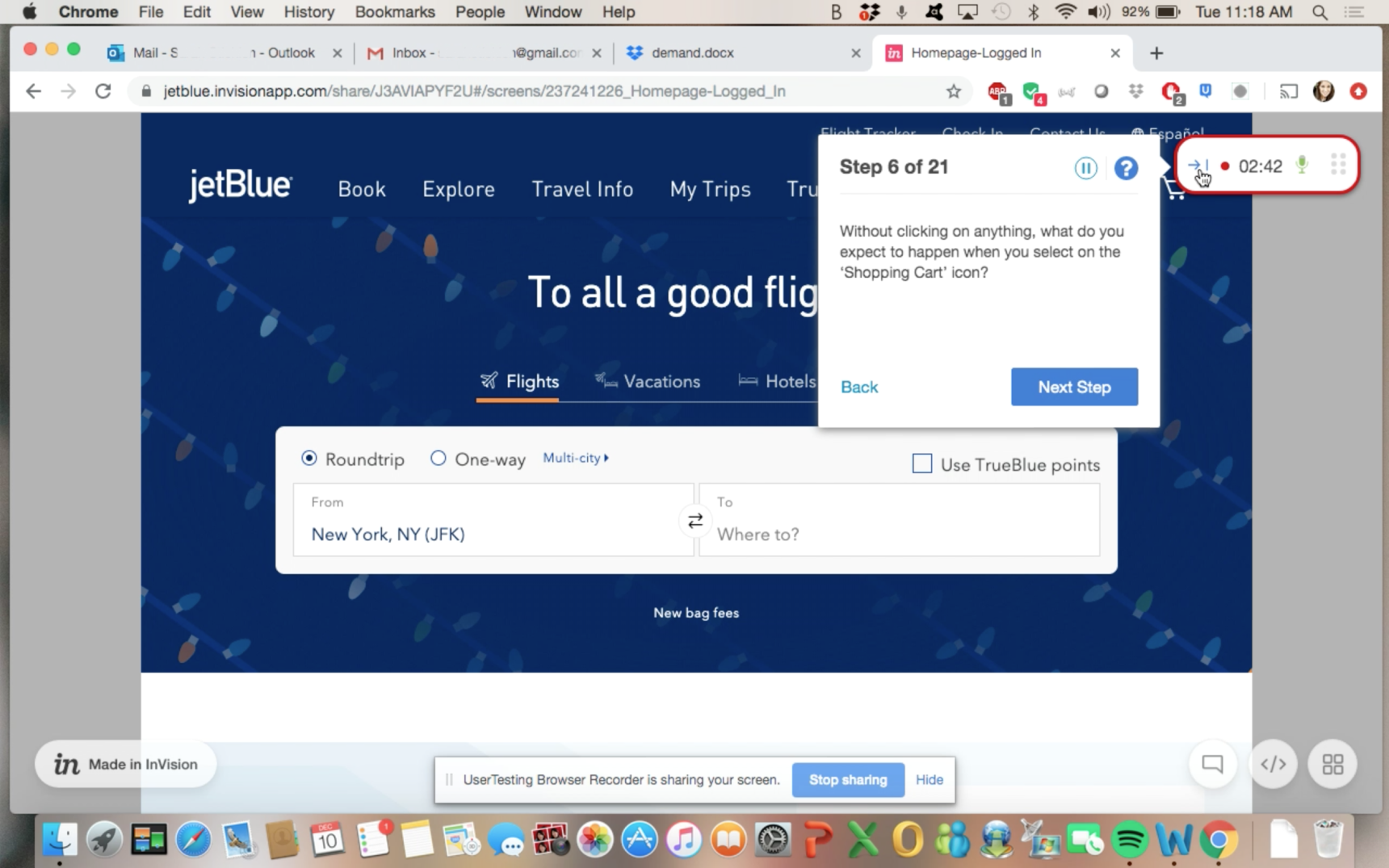
I ran an initial round of click prototype testing to establish a baseline understanding of the current state, user mental models, and problem areas. I planned and wrote the test script and created an InVision prototype of the navigation. This initial round revealed that the addition of the cart created confusion among users due to conceptual overlap with facets of the existing architecture. We also learned users were confused by some of the content paths and navigation labels.
2. CARD SORTING
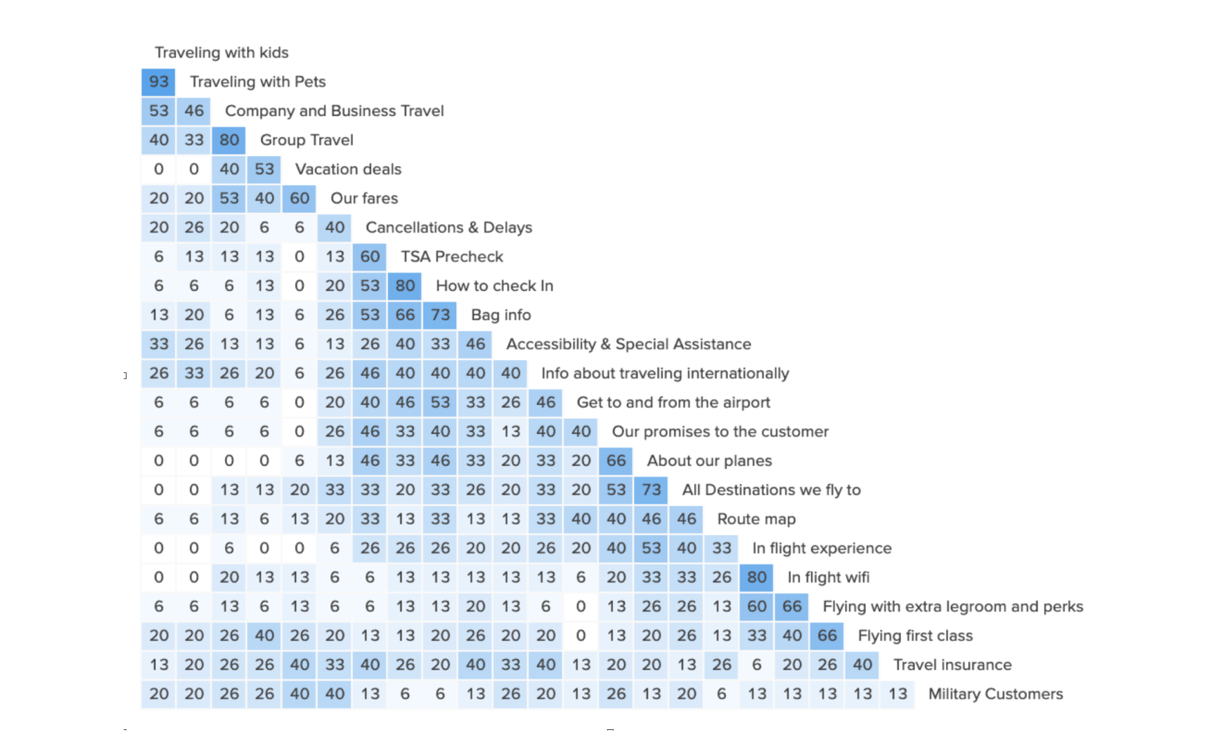
For the next round, I leveraged a series of card sorts and word association tests. Card sorting was a great way to understand users’ mental models and solicit suggestions for user-centered labels. For example, we learned the majority of users didn’t understand what “Ground transport” meant. Changing the navigation label to “Get to and from the airport” yielded much better task success. Similarly, “Travel Bank” was relabeled “Travel Credits” to align with users’ vocabulary.
3. TREE TESTS
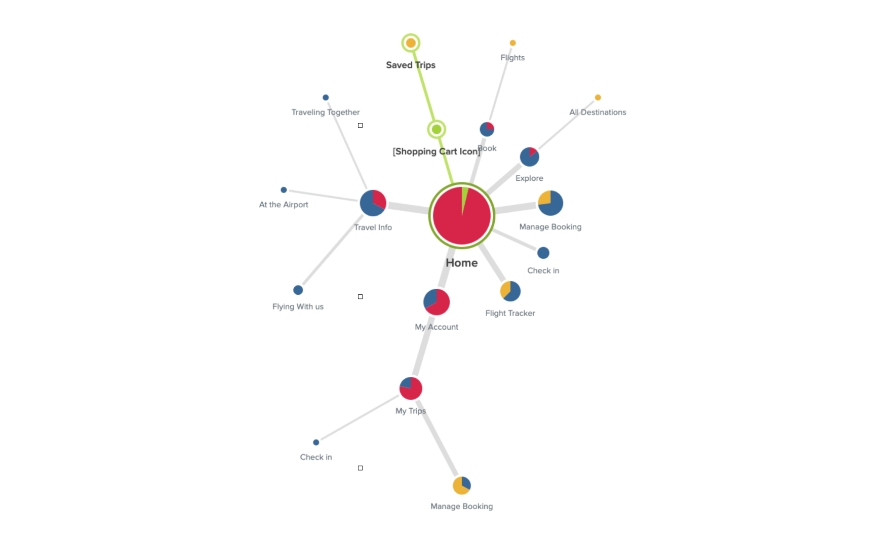
Once this research was synthesized, I created and tested a series of hypothetical IA models via iterative tree tests. Participants completed tasks designed to assess the findability and discoverability of key travel content, using the old JetBlue navigation as a control. The A/B tree tests clued us in to users’ mental models, whether labels were clear, and helped us refine troublesome pathways. We were able to easily compare each subsequent test to a baseline, and to systematically validate our solutions in the process.
Prototyping
After solidifying the information architecture and testing it through a series of tree tests, we created a high fidelity prototype with a realistic, fully designed interface that we then validated with users.


Outcomes
Our final recommendation paired fewer choices with more intuitive labels, helping users to make decisions quicker and more confidently.
Highlights
Simplified navigation to highlight popular content and reduce decision fatigue.
Enhanced alignment with user mental models and language.
Used action-oriented labels to prioritize user needs.
Improved task success rates.


